Renovating your kitchen is an exciting endeavor, and choosing the perfect color palette is a crucial component of the process. The colors you select will set the tone and atmosphere of your kitchen, making it a space that is visually appealing, functional, and reflective of your personal style. Considerations such as kitchen style, size, layout, lighting conditions, and functionality should guide your color selection. Understanding color theory, including the basic color wheel and color associations, can help you make informed decisions when choosing a palette.
To assist you in your kitchen renovation journey, this article provides guidance on how to choose the perfect palette for your kitchen and explores popular color palettes. it offers additional tips for successful color selection, including sampling colors before committing, considering long-term appeal, and seeking professional advice if needed. By carefully selecting a color palette, you can transform your kitchen into a beautiful and harmonious space that you will love for years to come.
Why is Choosing the Perfect Palette Important for Your Kitchen?
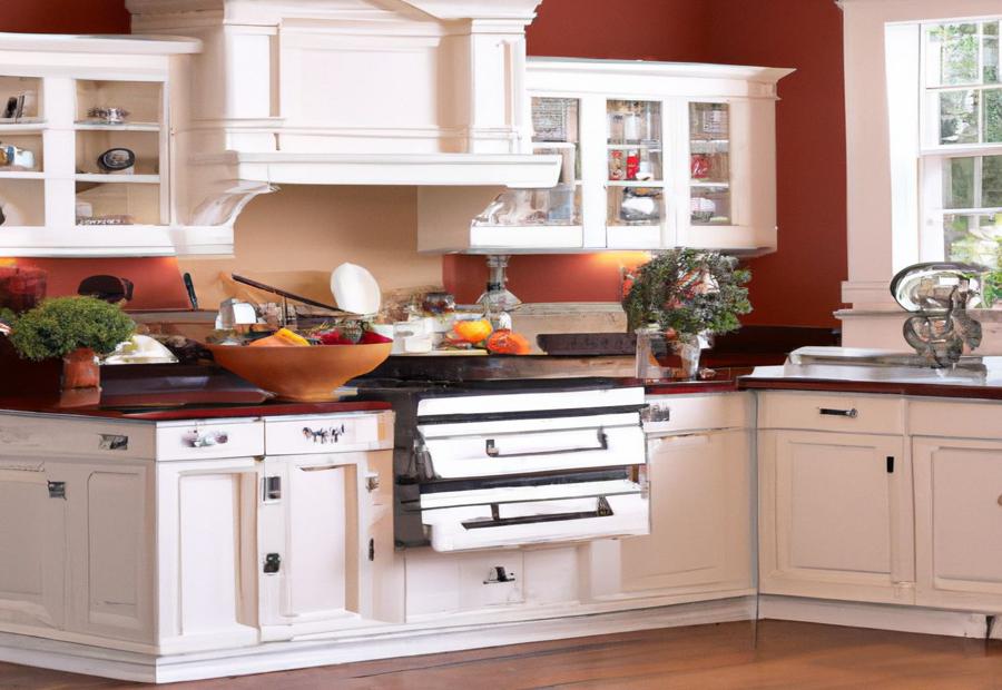
Photo Credits: Build-Wire.Com by Austin Nguyen
When it comes to renovating your kitchen, one crucial element that deserves your attention is choosing the perfect color palette. But why is this decision so important? In the following sections, we’ll unveil the reasons behind the significance of selecting the right palette for your kitchen. Let’s dive into the considerations and factors that play a role in making this choice – it’s time to reimagine your kitchen with a fresh burst of color!
Considerations for Kitchen Palette Selection
When selecting a palette for your kitchen, there are several important considerations to keep in mind:
| 1. Kitchen Style | Take into account the overall style and theme of your kitchen. Consider the design elements and desired atmosphere when choosing a palette that complements them. |
| 2. Size and Layout | Consider the size and layout of your kitchen. When it comes to smaller kitchens, lighter colors can help create an illusion of space. On the other hand, darker colors can add warmth and coziness to larger kitchens. |
| 3. Lighting Conditions | Take the natural and artificial lighting in your kitchen into consideration. Different colors can react differently to light, so choose a palette that will enhance the lighting conditions and create the desired ambiance. |
| 4. Functionality and Practicality | Think about the functionality and practicality of the palette. Select colors that are easy to clean and maintain, as the kitchen is a high-traffic area prone to spills and stains. |
| 5. Harmonious Color Schemes | Create a harmonious color scheme by selecting colors that complement each other. Consider using a combination of neutral tones with pops of vibrant colors or opt for a monochromatic or contrasting color scheme. |
By considering these considerations for kitchen palette selection, you can make an informed decision when choosing the perfect palette for your kitchen.
Understanding Color Theory
Photo Credits: Build-Wire.Com by Juan Hill
Discover the fascinating world of color theory in kitchen renovations! Uncover the secrets of the basic color wheel and explore the intriguing meanings and associations behind different hues. From the calming effects of blues to the stimulating power of reds, this section will unlock the potential of color in creating the perfect palette for your kitchen. Get ready to dive into the vibrant world of color theory!
Basic Color Wheel
Color Associations and Meanings
Understanding color associations and meanings is crucial when choosing the perfect palette for your kitchen renovation. Different colors evoke different emotions and can have a significant impact on the overall atmosphere of your kitchen.
- Red: Associated with passion and energy, red can add intensity and warmth to your kitchen. It can stimulate appetite and create a lively, inviting space.
- Yellow: A color that represents happiness and optimism, yellow can make your kitchen feel sunny and cheerful. It can promote positivity and enhance the overall mood in the room.
- Blue: Often associated with calmness and tranquility, blue can create a serene and relaxing environment in your kitchen. It can also give a sense of cleanliness and freshness.
- Green: Symbolizing nature and harmony, green can bring a sense of balance and renewal to your kitchen. It can create a soothing and refreshing ambiance.
- Orange: With its vibrant and energetic nature, orange can add warmth and enthusiasm to your kitchen. It can create a lively and welcoming space.
- Purple: A color that is often associated with luxury and creativity, purple can bring a sense of elegance and sophistication to your kitchen. It can add a touch of uniqueness and opulence.
When choosing colors for your kitchen, consider the emotions and atmosphere you want to cultivate. Think about the function of the space and how different colors can enhance that. Experiment with different combinations to create a harmonious and visually appealing palette that reflects your personal style and meets your kitchen renovation goals.
How to Choose the Perfect Palette for Your Kitchen
Photo Credits: Build-Wire.Com by Noah Perez
Choosing the perfect palette for your kitchen is an exciting yet daunting task.
Let’s dive into the art of selecting colors that complement your kitchen space effortlessly.
We’ll explore how to determine your kitchen style, consider the size and layout, assess lighting conditions, prioritize functionality and practicality, and create harmonious color schemes, all with the aim of transforming your kitchen into a vibrant and inviting space.
So, let’s get inspired and get ready to revamp your culinary haven!
Determine Your Kitchen Style
When determining your kitchen style, it’s important to consider your personal preferences and the overall aesthetic you want to achieve. Here are some factors to consider:
- Color palette: Decide on the color scheme that best suits your style. Whether you prefer a neutral, monochromatic, or bold and vibrant palette, choose colors that resonate with your taste.
- Mood: Consider the atmosphere you want to create in your kitchen. Is it a cozy and rustic space or a sleek and modern one? Determining the mood will help guide your style choices.
- Materials and finishes: Think about the materials and finishes you want to incorporate. From natural wood and stone to stainless steel and high-gloss surfaces, select materials that align with your desired style.
- Cabinetry: Consider the type of cabinetry that complements your style. From traditional raised panel doors to minimalist flat-panel designs, choose cabinets that reflect your preferred aesthetic.
- Appliances: Decide on the appropriate appliances that fit your style and functional needs. Whether you prefer classic stainless steel or bold colored appliances, ensure they integrate seamlessly with your overall kitchen design.
- Accessories and accents: Pay attention to the smaller details that can enhance your kitchen style. From decorative lighting fixtures to unique backsplash tiles and statement hardware, incorporating these accents can elevate your kitchen’s overall look.
Consider the Size and Layout of Your Kitchen
When considering the size and layout of your kitchen, it is important to carefully assess the available space and make informed decisions that will optimize both the functionality and aesthetics of the space. Taking into account several key factors will help you create a kitchen that is both practical and visually appealing.
One important factor to consider is space utilization. Take the time to assess the available space and determine the best layout for your kitchen. Consider the placement of appliances, cabinetry, and countertops to ensure an efficient workflow and maximize storage capacity.
Another factor to keep in mind is traffic flow. Consider the movement patterns in your kitchen and plan the layout accordingly. Ensure that different areas, such as the cooking, prep, and dining areas, have easy access without obstructing pathways or creating congestion.
Ergonomics is also a crucial consideration. Take into account the ergonomic principles to enhance the usability and comfort of your kitchen. Make sure that the height of countertops, cabinets, and appliances is suitable for your needs and promotes ease of use.
Natural light should also be evaluated when planning the layout of your kitchen. Take into consideration the natural light sources in your kitchen and position work areas, such as the sink and countertops, near windows to take advantage of the natural light. This will create a bright and inviting space.
Visual balance is another important aspect to consider. Take into account the size and proportion of your kitchen when selecting colors and materials. Lighter colors can create an illusion of spaciousness in smaller kitchens, while darker colors can add warmth and depth to larger kitchens.
Lastly, ensure that your color palette complements the overall style and theme of your kitchen. Consider the existing materials, such as flooring and cabinetry, and select colors that harmonize with these elements.
By carefully considering the size and layout of your kitchen, you can create a functional and visually appealing space that meets your needs and enhances your cooking experience.
Assess Lighting Conditions
When assessing lighting conditions for your kitchen, it is important to follow a few steps to ensure you choose the perfect palette.
- Assess natural light: Take note of the direction and intensity of natural light in your kitchen. This observation will help you determine how colors will appear throughout the day.
- Consider artificial lighting: Take a look at the type and placement of artificial lighting fixtures in your kitchen. Different light sources can have an impact on how colors are perceived.
- Test color samples: Obtain samples of paint or material in the colors you are considering for your kitchen. Place them in different areas of the space and observe how they look under various lighting conditions.
- Consult with a professional: If you are unsure about how lighting will affect your chosen color palette, seek advice from a professional interior designer or color consultant. They can provide expert guidance based on your specific lighting conditions.
- Consider light bulb options: Different types of light bulbs emit different colors and qualities of light. Experiment with different bulb options to find the most flattering lighting for your chosen colors.
Assessing lighting conditions is crucial when selecting a color palette for your kitchen. By following these steps, you can ensure that your chosen colors will look their best in your kitchen’s lighting environment.
Prioritize Functionality and Practicality
When choosing the perfect color palette for your kitchen, it is important to prioritize functionality and practicality. Here are some considerations to keep in mind:
- Consider the purpose of your kitchen: Think about how you will be using your kitchen and what activities will take place there. If you do a lot of cooking and baking, it’s important to prioritize functionality and practicality by choosing colors that won’t show stains easily.
- Think about maintenance: Some colors may require more frequent cleaning or touch-ups. Consider how much time you are willing to spend on maintaining the appearance of your kitchen while prioritizing functionality and practicality.
- Assess lighting conditions: The lighting in your kitchen can greatly affect how colors appear. Take into account the natural light, as well as the artificial lighting, and choose colors that will work well under different lighting conditions, prioritizing functionality and practicality.
- Consider the size and layout of your kitchen: The size and layout of your kitchen can impact the choice of colors. Prioritize functionality and practicality by selecting lighter colors that can make a small kitchen appear larger or darker colors that can create a cozy atmosphere.
- Think about the overall style and mood you want to achieve: The colors you choose should complement the overall style or theme of your kitchen. Whether you prefer a modern, rustic, or traditional look, select colors that align with your design goals while prioritizing functionality and practicality.
By prioritizing functionality and practicality when choosing your kitchen color palette, you can create a space that is not only visually appealing but also meets the needs of your everyday activities.
Fact: According to a survey, 67% of people prioritize functionality as the most important aspect to consider when renovating their kitchen.
Create Harmonious Color Schemes
To create harmonious color schemes for your kitchen, follow these steps:
- Start by creating a harmonious color scheme: Choose a neutral or earth tone as your primary color. This will provide a calming and versatile foundation for your color scheme.
- Introduce complementary colors to achieve harmony: Select colors that are opposite each other on the color wheel to create balance and contrast. For instance, if your base color is a warm beige, consider adding touches of cool blue or green.
- Add depth and dimension with layered shades: Incorporate lighter and darker shades of your chosen colors to add depth and dimension to your kitchen. This will prevent your color scheme from looking flat or one-dimensional.
- Create a focal point for visual interest: Use a bold or vibrant color as an accent to draw attention to a specific area or feature in your kitchen. You can achieve this through colored appliances, backsplash, or furniture.
- Follow the 60-30-10 rule for a balanced composition: Use the 60-30-10 rule, where 60% of your color scheme is the main color, 30% is the secondary color, and 10% is the accent color. This will ensure a well-balanced and visually appealing composition.
By following these steps, you can successfully create harmonious color schemes that will enhance the overall aesthetic of your kitchen.
Popular Color Palettes for Kitchen Renovation
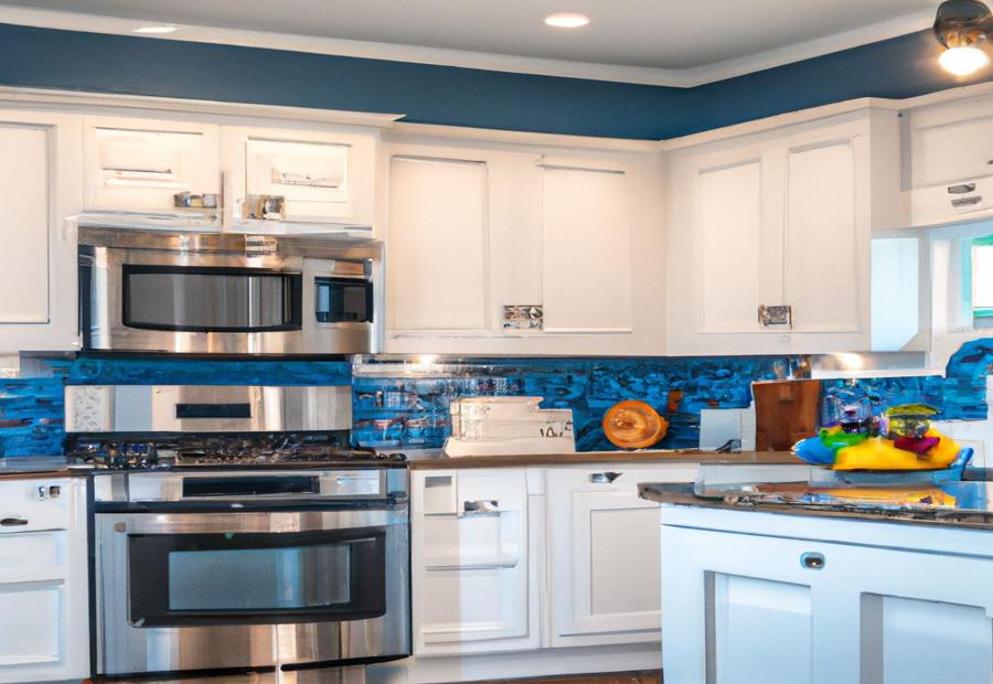
Photo Credits: Build-Wire.Com by Gabriel Harris
Looking to give your kitchen a fresh makeover? Dive into the world of popular color palettes for kitchen renovation. From soothing neutrals to bold and vibrant colors, we will explore different options to rejuvenate your space. Whether you prefer monochromatic schemes or contrast and complementary combinations, there is a palette to suit every taste. Get ready to infuse life and personality into your kitchen with the power of color!
Neutrals and Earth Tones
When it comes to choosing the perfect palette for your kitchen renovation, neutrals and earth tones can create a warm and inviting atmosphere. These colors have a timeless appeal and can easily blend with different kitchen styles and design elements.
| 1. Beige: | Beige is a versatile neutral that adds a sense of warmth and elegance to any kitchen. It pairs well with both light and dark accents and can create a cozy and inviting space. |
| 2. Brown: | Brown tones, such as chocolate, tan, or espresso, bring a natural and earthy feel to the kitchen. They work well in rustic or traditional kitchens and can be used for cabinets, flooring, or accents. |
| 3. Gray: | Gray is a popular choice for modern and contemporary kitchens. It comes in various shades, from light to dark, and provides a sleek and sophisticated look. Gray can be paired with other colors or used as the main color for a clean and minimalist aesthetic. |
| 4. Green: | Green tones, such as olive, sage, or moss, bring a refreshing and calming presence to the kitchen. They work well in farmhouse or country-style kitchens and can be incorporated through painted cabinets or tiled backsplashes. |
When working with neutrals and earth tones, you can add depth and interest by using different textures and finishes. Incorporate natural materials like wood or stone for a cohesive look. Additionally, consider the lighting conditions in your kitchen as it can impact how the colors appear. Get samples of different neutral and earth tone colors to see how they interact with your kitchen’s lighting and other elements before making a final decision.
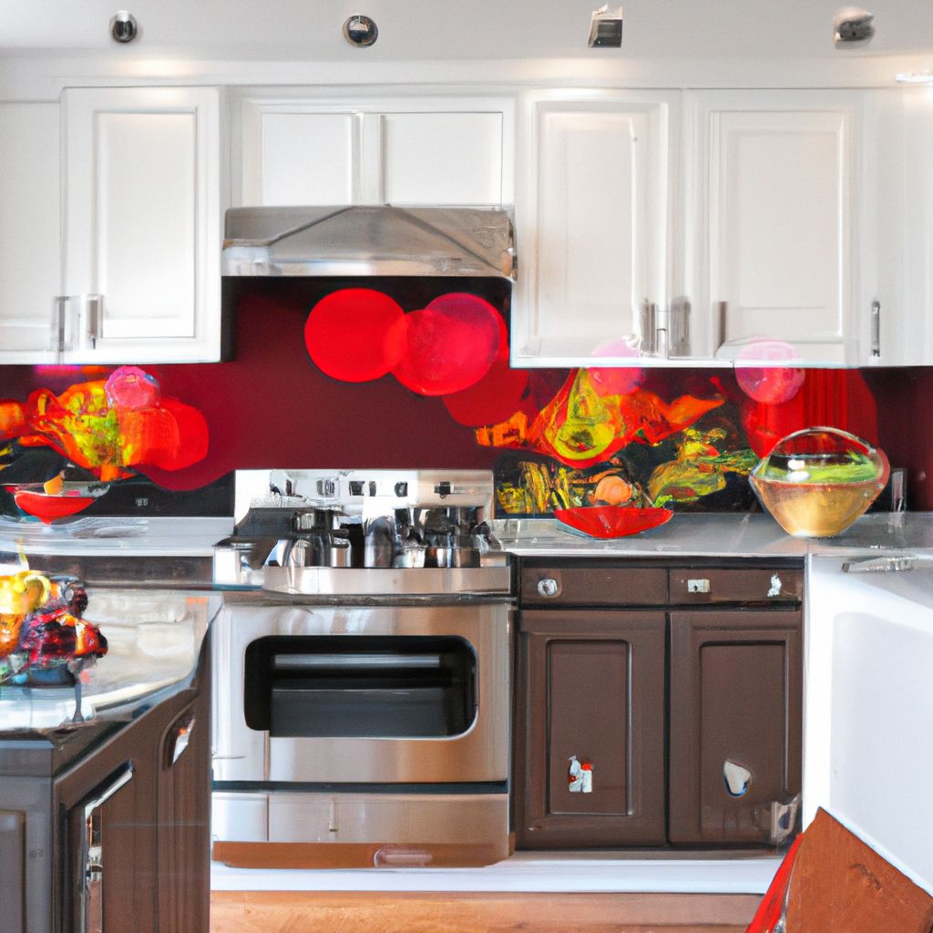
Bold and Vibrant Colors
Incorporating bold and vibrant colors can add a pop of excitement and personality to your kitchen space.
These dynamic colors can create a lively and energetic atmosphere in the kitchen.
Consider using bold and vibrant colors as accents in your kitchen, such as on the backsplash or kitchen island.
Red, orange, and yellow are examples of bold and vibrant colors that can stimulate the appetite and create a warm and welcoming ambiance in the kitchen.
Using bold and vibrant colors sparingly can create a focal point and draw attention to specific areas or design elements in the kitchen.
When incorporating bold and vibrant colors, it’s important to consider the overall color scheme and balance in the kitchen.
Pairing bold and vibrant colors with neutral tones can create a visually appealing contrast and prevent the space from becoming overwhelming.
Keep in mind that the intensity of bold and vibrant colors can impact the perception of space. In smaller kitchens, it’s advisable to use these colors in moderation to avoid making the space feel cramped.
Lastly, don’t be afraid to experiment and have fun with bold and vibrant colors in your kitchen renovation. Remember that color can be a powerful tool for expressing your personal style and creating a unique and captivating space.
Monochromatic Color Schemes
When it comes to kitchen renovation, monochromatic color schemes are a popular choice due to their elegant and harmonious aesthetic. These schemes consist of using different shades and tones of a single color throughout the kitchen, creating a cohesive and sophisticated look that stands the test of time. By sticking to a single color, monochromatic color schemes also enhance visual continuity, creating a sense of flow and harmony. The different shades and tones of the color can be used to highlight different elements in the kitchen, such as cabinetry or countertops.
Despite using only one color, monochromatic color schemes can still add depth and dimension to the kitchen design. This is achieved through the use of light and dark shades, which create visual interest. One of the great benefits of monochromatic color schemes is the flexibility in color choice. You can create a monochromatic scheme using any color of your choice, whether you prefer a peaceful blue, a warm earth tone, or a sleek gray. This allows you to tailor the color scheme to suit your personal style.
Another advantage of monochromatic color schemes is the easy coordination with accents and accessories in the kitchen. Since you’re working with a single color, it becomes easier to play with different textures and finishes within that color, creating visual interest. Next time you’re considering a kitchen renovation, don’t overlook the sophisticated and versatile options that monochromatic color schemes can offer.
Contrast and Complementary Color Palettes
To create visually striking and harmonious color schemes in your kitchen renovation, consider incorporating contrast and complementary color palettes. These palettes involve selecting colors that are opposite each other on the color wheel, creating a vibrant and dynamic effect.
A contrast color palette involves pairing colors that are very different from each other. For example, combining a deep navy blue with a bright yellow can create a stunning and eye-catching look. This contrast can be applied to various kitchen elements, such as cabinets, countertops, and backsplashes, to add visual interest and depth.
On the other hand, complementary color palettes involve using colors that are located opposite each other on the color wheel. This creates a balanced and harmonious look for your kitchen. For example, pairing a cool blue with a warm orange can create a pleasing contrast while still maintaining harmony in the overall design.
When using contrast and complementary color palettes, it’s essential to consider the overall mood and style of your kitchen. For a bold and modern look, opt for high-contrast combinations like black and white or red and green. For a more subtle and sophisticated look, choose complementary colors with less contrast, such as purple and yellow or blue and orange.
Experiment with different combinations and sample colors before committing to a final palette. Consider how the colors will interact with the natural and artificial lighting conditions in your kitchen. And remember, seeking professional advice can help ensure that your chosen color palette complements your kitchen’s style and enhances its overall aesthetic appeal.
Incorporating contrast and complementary color palettes in your kitchen renovation can elevate the design and create a visually stunning space that reflects your personal style and taste.
Additional Tips for Successful Color Selection
“
When it comes to selecting the perfect color palette for your kitchen, there are some additional tips that can make all the difference. From sampling colors before making a commitment to considering the long-term appeal, these insights will guide you in creating a kitchen aesthetic that will stand the test of time. And if you’re feeling overwhelmed, don’t hesitate to seek professional advice – sometimes, a fresh perspective is just what you need for a truly transformative kitchen renovation.
”
Sample Colors before Committing
It is crucial to sample colors before committing to a specific palette for your kitchen renovation. By sampling colors, you can ensure that the chosen shades complement each other and create the desired effect in your kitchen.
| Benefits of Sampling Colors: |
|---|
| 1. Accurate Representation: Sampling allows you to see the true shade of a color in your kitchen’s lighting conditions, avoiding any surprises or disappointments. |
| 2. Coordination: It allows you to compare different colors and see how they work together in your kitchen, ensuring a harmonious and cohesive look. |
| 3. Style Assessment: By sampling different colors, you can assess how they align with your desired kitchen style, whether it’s modern, traditional, or eclectic. |
| 4. Long-Term Satisfaction: Sampling helps you avoid potential regrets by allowing you to visualize how the colors will look in your kitchen over time. |
Therefore, before making a final decision on your kitchen palette, take the time to sample colors. Paint small patches on your walls or acquire color swatches to see how different shades interact with your kitchen’s elements. This simple step will assist you in choosing a color scheme that you will love for years to come.
Consider the Long-Term Appeal
When choosing your kitchen color palette, it is essential to consider the long-term appeal. You want colors that will maintain their aesthetic appeal for years to come. Here is a table that provides some important factors to consider:
| Factor | Importance | Considerations |
| Color Trends | Medium | Keep in mind that trendy colors may go out of style quickly, while more classic and timeless colors are more likely to maintain their appeal. |
| Personal Taste | High | Choose colors that you personally enjoy and resonate with your style. Your kitchen should reflect your preferences and make you feel comfortable. |
| Color Psychology | Medium | Consider the emotional effects of different colors. Opt for colors that promote a positive atmosphere and create a welcoming environment. |
| Flexibility | High | Ensure the chosen color palette can easily accommodate changes in furniture, appliances, and other design elements in the future. |
| Longevity | High | Choose colors that have proven to be durable and timeless, such as neutral tones or classic shades that have stood the test of time. |
When considering the long-term appeal of your kitchen color palette, it is crucial to balance personal preferences and current trends with colors that will continue to look stylish and appealing. Remember, the goal is to create a space that you will love for years to come.
Fact: Did you know that certain colors, such as neutrals and earth tones, are known for their timeless appeal and can easily adapt to changing design trends?
Seek Professional Advice, if needed
Seeking professional advice, if needed, is an essential step when selecting the ideal palette for your kitchen renovation. Design professionals, such as interior designers or color consultants, possess expertise in color selection and can offer valuable insights and recommendations tailored to your specific needs and preferences.
By consulting with professionals, you can reap the benefits of their knowledge of color theory, current design trends, and practical considerations for your kitchen. They will assist you in achieving the right balance between aesthetics and functionality by taking into account factors like lighting conditions, kitchen style, and layout.
Moreover, professionals can help you evade costly mistakes by steering clear of color choices that may not complement your kitchen space. They can provide you with samples, color swatches, and visual representations of various color palettes, enabling you to make an informed decision.
Remember, seeking professional advice does not imply blindly adhering to it. It is still crucial to express your own preferences and vision for your kitchen. The role of professionals is to offer guidance and expertise that will aid you in accomplishing your desired outcome.
Frequently Asked Questions
FAQ 1: How can I add color to my kitchen without doing a major overhaul?
One way to add color to your kitchen without a major overhaul is by incorporating brightly colored pendants, such as art glass or Tiffany style, in brushed gold, bronze, or black. You can also use chalkboard paint in various colors on a kitchen wall or door for a fun and convenient space to write or doodle.
FAQ 2: What factors should I consider when choosing a color scheme for my kitchen remodel?
When choosing a color scheme for your kitchen remodel, consider factors such as the layout and style of your kitchen, the amount of natural light it receives, and how it will mesh with the rest of your home decor. Additionally, think about the mood you want to create in your kitchen and seek professional advice if needed.
FAQ 3: What are some popular color combinations for kitchen remodels?
Popular color combinations for kitchen remodels include contrasting hues like white tiled walls with a herringbone pattern, stunning cabinetry in icy blue with bold touches, and mint green cabinets paired with a bright white color palette. Mixing and matching colors can also create a personalized and on-trend look.
FAQ 4: Should I stick to neutral colors for my kitchen cabinets and countertops?
Sticking to neutral colors for your kitchen cabinets and countertops, such as white or tan, is a timeless choice as they blend well with other colors in the kitchen. Simple countertops like granite or quartz in neutral shades are also recommended as colored countertops can quickly look dated.
FAQ 5: How can I incorporate color through accessories and linens in my kitchen?
You can add color to your kitchen through accessories and linens by choosing vibrant dinnerware, utilizing colorful kitchen linens, and incorporating chair cushions in bold tones. Additionally, you can display colorful stemware in a wine glass rack for a pop of color.
FAQ 6: Is it possible to create a cohesive color scheme for my kitchen that complements other rooms in my home?
Yes, it is possible to create a cohesive color scheme for your kitchen by considering the color scheme of adjoining rooms. This can help create a seamless transition and a harmonious look throughout your home, especially if you have an open floor plan where the kitchen and living room are visible in the same space.